A Brooklyn Park bathroom underwent a modern transformation with the help of Kaitlyn Stokes, a former designer with Crystal Kitchen + Bath, and now designer at Belle Kitchen. Her creativity helped transform this outdated early 2000s space into something rich, welcoming and remarkable. The former space featured basic off-white cabinetry, crumbling slate tile and tones of natural stone that suffered from water damage. “Everything was in the same position. We did not move anything. We just upgraded everything. It was formerly your typical builder-grade bathroom,” she says.
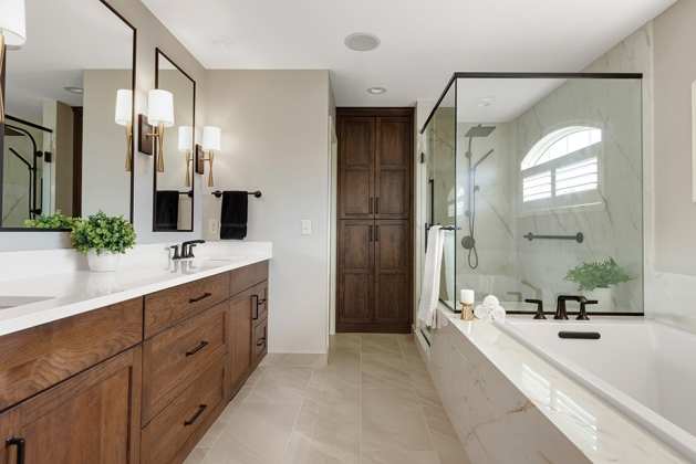
The homeowners were focused on creating an open space because their shower was enclosed, and the vanity space was not optimal in terms of size. While the layout of the bathroom essentially stayed the same, the client did want specific changes. After removing the shower walls, Stokes says the homeowners knew that they wanted drop-in bathing tub, larger mirrors and more functional cabinetry. “I think that it has a grander feel to it than other bathrooms I’ve designed even though we didn’t change the layout at all. I think it shows homeowners that there is a lot of potential in their homes they may not see,” she says.
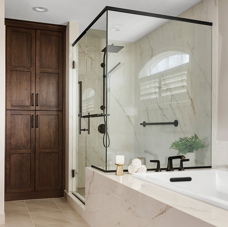
The defining features might just be the HD-printed porcelain slabs that mimic calacatta marble—featuring large warm-toned veining patterns. The homeowners settled on porcelain because they wanted a seamless look without the hassle that comes with cleaning grout lines in materials like tile or natural stone. This elegant approach also requires less maintenance during installation because it is lighter in weight and does not require any sealing agents. As for the porcelain upkeep, the pristinely-smooth surface allows liquid to slide right off instead of absorbing into the material. (The excess fluid could potentially cause deterioration of the material.)
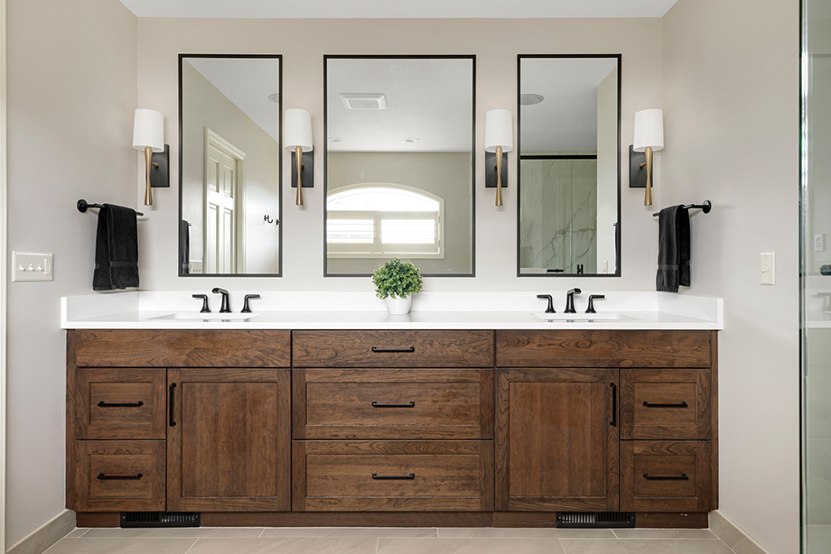
Other key design elements include the natural cherry wood cabinets in a deep chocolate stain and the inclusion of black hardware and fixtures. “The client knew that she wanted to do black fixtures right away,” Stokes says. “We wanted to bring in another element that would add contrast and then added another natural element, the wood cabinets, which brought out golden veining in the porcelain.” Chosen by the clients, the neutral tones in this space provide a sense of warmth—a vibe that is emulated throughout the rest of their home.


