A restaurant is expensive to build. Purchasing commercial kitchen equipment and topping it off with aesthetically pleasing decor that holds up to the wear and tear of customers often exceeds a half million dollars.
Those costs are merely the basics, with brand-conscious design added atop the core cost. It’s something that restaurants put a lot of thought into, and while color schemes and furniture styles will dominate a diner’s first impression, the nuances of layout, lighting and shapes are what dictate the experience, affecting both menu orders and memories.
Two notable concepts in Maple Grove are located in The Fountains at Arbor Lake, where Café Zupas sits at the western corner of Elm Creek Boulevard and Fountains Drive in modernistic contrast to the feminine curves of Nadia Cakes across the street. While the shops set different visual moods, both are ultimately about the food they prepare and how they’d like customers to perceive it. The hard angles, metal and glass of Café Zupas and the Victorian couch and marble-topped cupcake tables inside Nadia Cakes don’t just set the mood, they define expectations.
Nadia Cakes
With a successful bakery in Palmdale, Calif., opening a second shop was a big step for Nadia Cakes owners Abby and Carlos Jimenez. “We had to be budget conscious to get our first store open,” Abby says. In truth, she admits, it was paid for on a maxed-out credit card. For their second shop, “We wanted all the things we wished we’d had.” To get that message across, they opened the checkbook. “There are a lot of cupcake shops that might be more serious, more delicate or stuffy,” says Lisa Britz, who designed the Maple Grove store for Partners & Sirny Architects. “The idea was to be luxurious and comfortable, feminine and festive.”
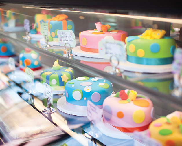
The charming cupcakes are not to be overshadowed by full-sized cakes that radiate creativity. They have their own display case, and a multi-tiered masterpiece, each layer balanced precipitously upon the other, takes prominence in a special display window in the seating area. With the addition of a crystal chandelier, Nadia Cakes’ interior says “special moment.”
“Carlos and Abby are very similar to how they design their cupcakes,” Britz continues, “fun and easy to connect with.” The goal was to create an immersive experience where customers will frame Nadia Cakes as an event, rather than a daily errand.
It’s been backed up by customer experience. “We’ve probably had 15 proposals right there in that seating area,” Abby says, pointing to a sofa that she had custom upholstered to match the fireplace and miniature-size cupcake tables in the ornate seating area. The couch is used for public seating, but also for consultations on planning life events like weddings and parties. “We wanted an area unlike anywhere else,” she explains. Everything is special and there is no utility furniture to be found.


Café Zupas
At Café Zupas, the emphasis is a clean environment with no-nonsense food that emphasizes a healthy lifestyle: namely fresh sandwiches, soups and salads. “It’s important for us that the brand is resonating on every touchpoint: when [customers] drive up, see the exterior, see the different glass and how open everything is,” explains Jen Robinson, PR and content marketing manager at Café Zupas headquarters in Sandy, Utah. “They see the metal and it feels modern. Then you see the colorful foods and the spices,” she says, explaining the trajectory of that first impression. With a modern industrial tone, the ceilings are exposed and the drink station in the center is the only interruption to a sea of tables beyond the checkout.
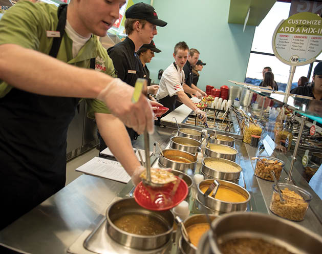
The pseudo-industrial sheen accents the fresh food, reinforced by Zupas’ red serving bowls. “The emphasis is on the food and the color of the food. The kitchen is white; it transitions from the lobby so you see the food on the line and it highlights the food. The colors and the textures of the food are what people notice,” explains Gheen Hillman, vice president of marketing. A key aspect of the Maple Grove store for Café Zupas, which will have 40 restaurants nationwide by the end of the year, is the window into the kitchen behind the ordering station.
Maple Grove was one of the first Café Zupas locations to feature that window and it’s become a company centerpiece. “Part of the design element is for people to see that we really do make everything in house,” explains Brandon Pfunder, senior designer of both Maple Grove’s restaurant and many other locations.
“When Rob Seely and Dustin Schulties first started this company they were very guarded about the processes they used to build their soups,” Pfunder says. The window changed the company’s approach, putting the spotlight on their high-end kitchen equipment and fresh ingredients used for items like soups, salad dressings and other items that many restaurants have prepared elsewhere. “That window really changed how we think about our company,” Pfunder explains.
“It’s a very modern concept and it’s something you find in a lot of chic, fine dining environments…it elevates us beyond just another fast-casual restaurant,” Robinson adds. The effect isn’t meant to show off; it’s to be subconscious, they say. The glossy metal, sharp angles and glimpse behind the scenes make the food feel clean and contemporary.
“There are a lot of restaurants that try to look like a bakery or old-fashioned or rustic,” Pfunder says. At Café Zupas, they want to be different. “It is a trick when you’re doing modern to also make it inviting and warm,” he adds, but with the right color schemes and subtle wood inclusions, it changes from cold to warm. “People feel like they’re in someplace new and current,” Pfunder ays.
The color changes and hard-edged designs point directly to the food, much as the glass cases at Nadia Cakes are designed to surround the customer in a world of cupcakes. The concepts are starkly different, but the subtleties seek the same results. Café Zupas mirrors a message of health conscious dining for a family on the go, while Nadia Cakes is to be an escape from the blasé day-to-day. From Pfunder’s open design with bright LED lights to the embracing charm laid out by Britz, design is an extension of both personality and purpose.


(Photos courtesy of Café Zupas)


